
Etern Learning
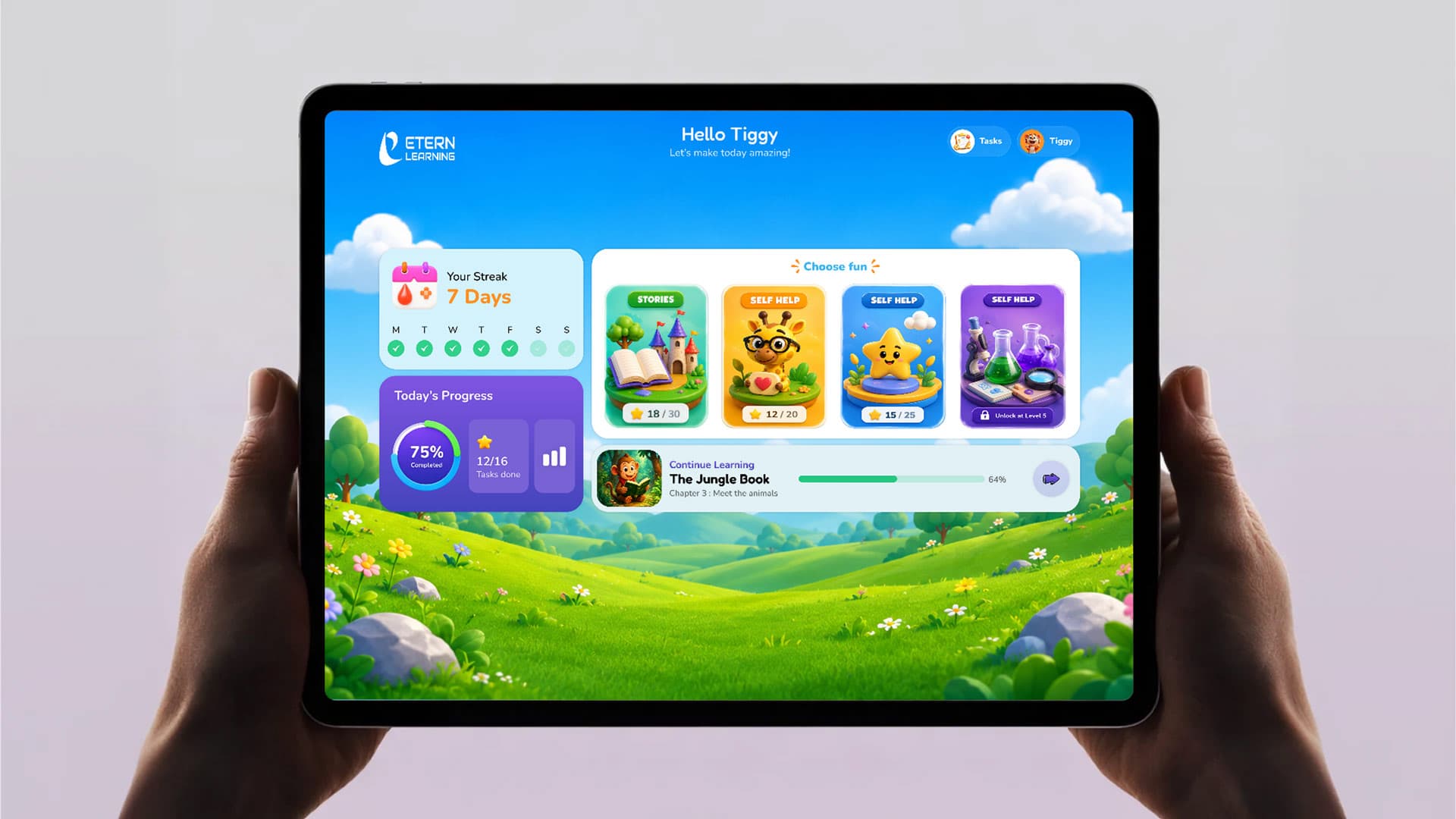
A learning app for ages 3–7, designed for a child navigating alone — streaks, a progress ring, and a mascot doing the explaining a paragraph of copy would otherwise have to do.
Project details
- Category
UI/UX Design
- Discipline
Mobile App Design
About this project
Overview
Etern Learning needed an app two completely different people would use minutes apart from each other — a parent filling in a signup form, then handing the phone to a child who can't fully read yet. Most edtech apps pick one audience and make the other tolerate it.
We designed two distinct interaction languages inside one product: a calm, form-based flow for the parent — clear labels, a visible privacy note, nothing playful competing for attention while they're entering real information — and an icon-led, mascot-driven world for the child once the account exists, where a tiger named Tiggy does the explaining a paragraph of copy would otherwise have to do.
The Challenge
A three-to-seven-year-old can't read a settings menu, and won't stay on a screen that doesn't reward them within a few taps of opening it. Every daily-use decision had to work for a child navigating alone: no destination more than one tap from the home screen, feedback that reads instantly — a filled star, a checkmark, a percentage ring — rather than as text, and a sense of progress visible before a single lesson is finished.
Our Approach
The home screen leads with what changed since yesterday, not a menu — the streak, the day's progress ring, and one "continue learning" card picking up exactly where the last session stopped, so opening the app has an immediate, visible payoff. Below it, a content shelf mixes categories like Stories and Self Help into a single browsable row instead of separate tabs a child would have to understand first, and locking content behind a level number turns a limitation into an incentive instead of a wall.
Onboarding runs in the opposite register on purpose: a linear form with real labels and a stated privacy commitment, then a lighter profile step — choosing an avatar, picking a learning buddy from a small set of characters — that eases a first-time child user into the app's tone before the gamified home screen arrives. The same tiger mascot appears throughout both modes, so the handoff from "parent finishing setup" to "child starting to play" never feels like switching apps.
What we did
- UI/UX Design
- Mobile App
- Kids Edtech
- +more
Inside the project
The home dashboard leads with streaks, today's progress, and one "continue learning" card — not a menu.
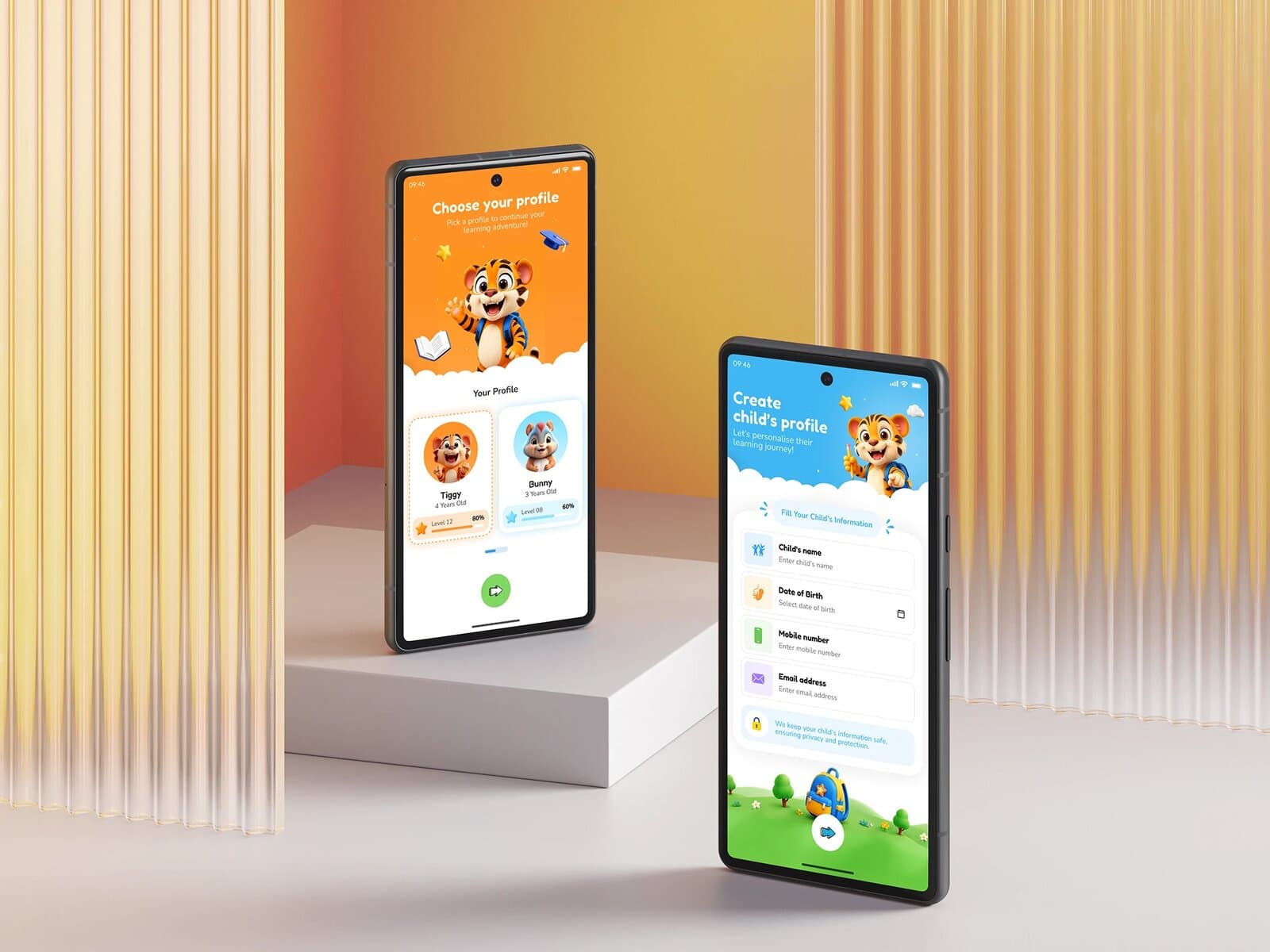
Onboarding runs in a calmer register: a real form for the parent, then a lighter profile step for the child.
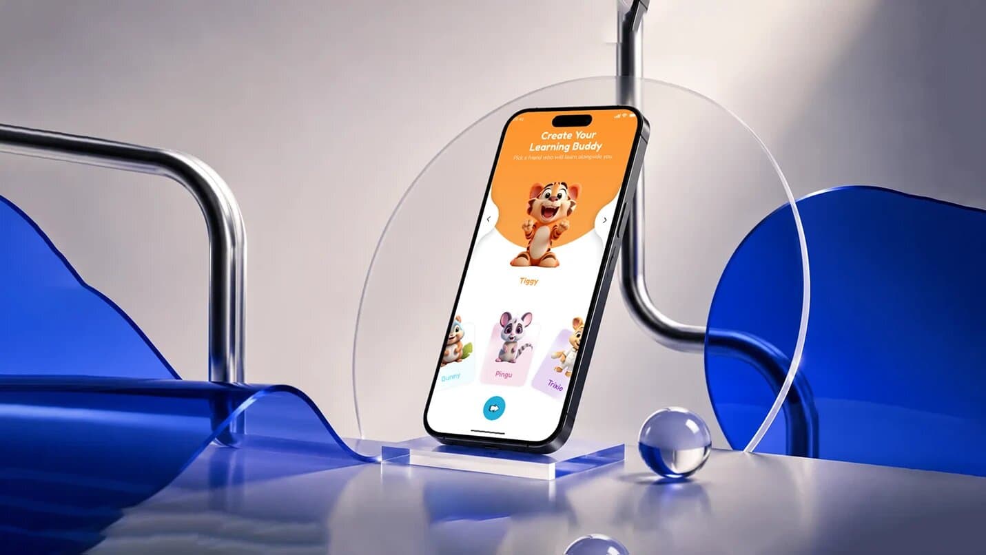
Picking a learning buddy turns the last onboarding step into the first moment of play.

Every Great Brand Begins
with a Great Conversation.
We listen, collaborate, and uncover insights that turn ideas into meaningful brand experiences.
Schedule a call