
SIFAT
An exam-prep LMS built around one habit: open the app, see exactly where you left off, and get back into it in one tap.
Project details
- Category
UI/UX Design
- Discipline
Mobile App Design
About this project
Overview
SIFAT is exam prep, and exam prep is a lot of material — subjects, textbooks, syllabi, practice sets, solved papers, question banks, all of it needing to be reachable without turning the app into a file browser. The habit that actually matters for a product like this isn't a single clever feature, it's whether a student opens the app again tomorrow.
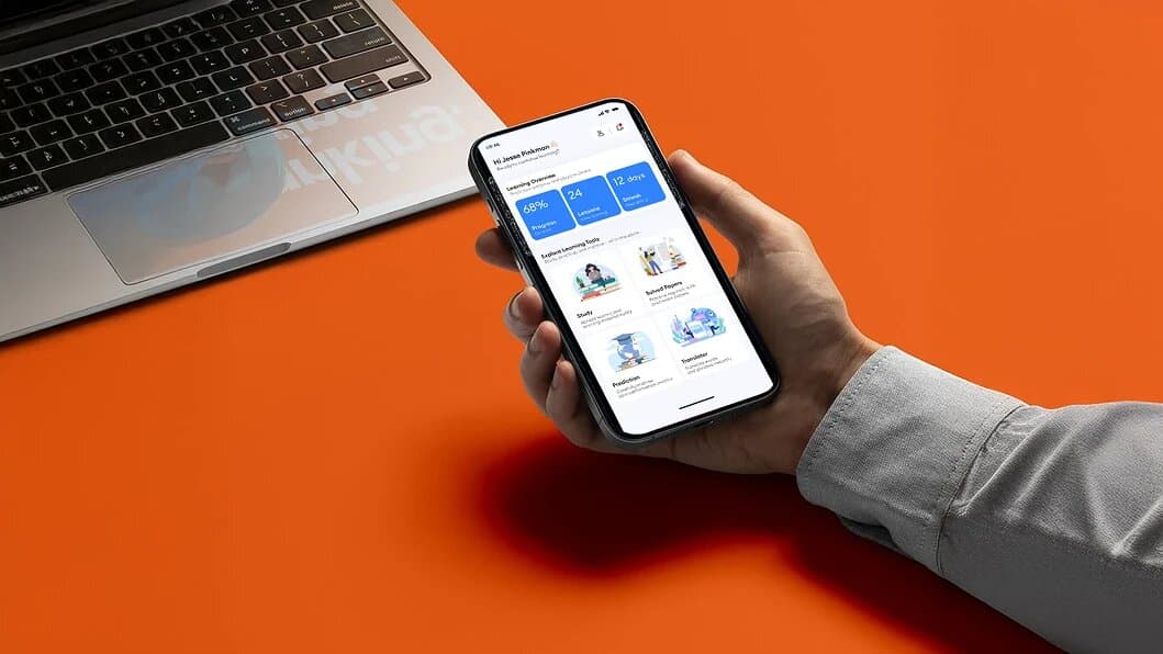
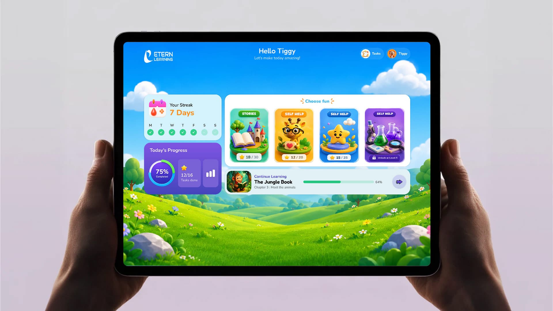
We built the home screen around three concrete numbers instead of a dashboard of charts — progress percentage, lessons completed, days on streak — and put resuming the last lesson one tap away, before any browsing is required at all.
The Challenge
Every subject carries the same five-plus resource types — textbook, syllabus, practice, questions, question bank — and a student is usually working across several subjects at once. List every resource for every subject on one screen and the app stops feeling like a study companion and starts feeling like a directory. The interface had to scale to a full curriculum without dumping the full curriculum on screen at once.
Our Approach
Subjects collapse to one line by default — name, resource count, a progress bar — and only expand into their full row of resource icons on tap. A student scanning for what to study next sees every subject at a glance; a student who already knows what they're doing gets straight to the specific tool without extra navigation in between.
The four modes a student actually alternates between during a session — Study, Solved Papers, Prediction, Translator — sit as large tiles directly on the home screen rather than behind a menu, because these are moves made constantly through a study session, not settings configured once and forgotten. Everything else, including sign-in, stays in a plain, unhurried form so the app reads as a serious study tool from the first screen, not a game with a study mode attached.
What we did
- UI/UX Design
- Mobile App
- EdTech
- +more
Inside the project
Three concrete numbers instead of a dashboard — progress, lessons completed, streak.
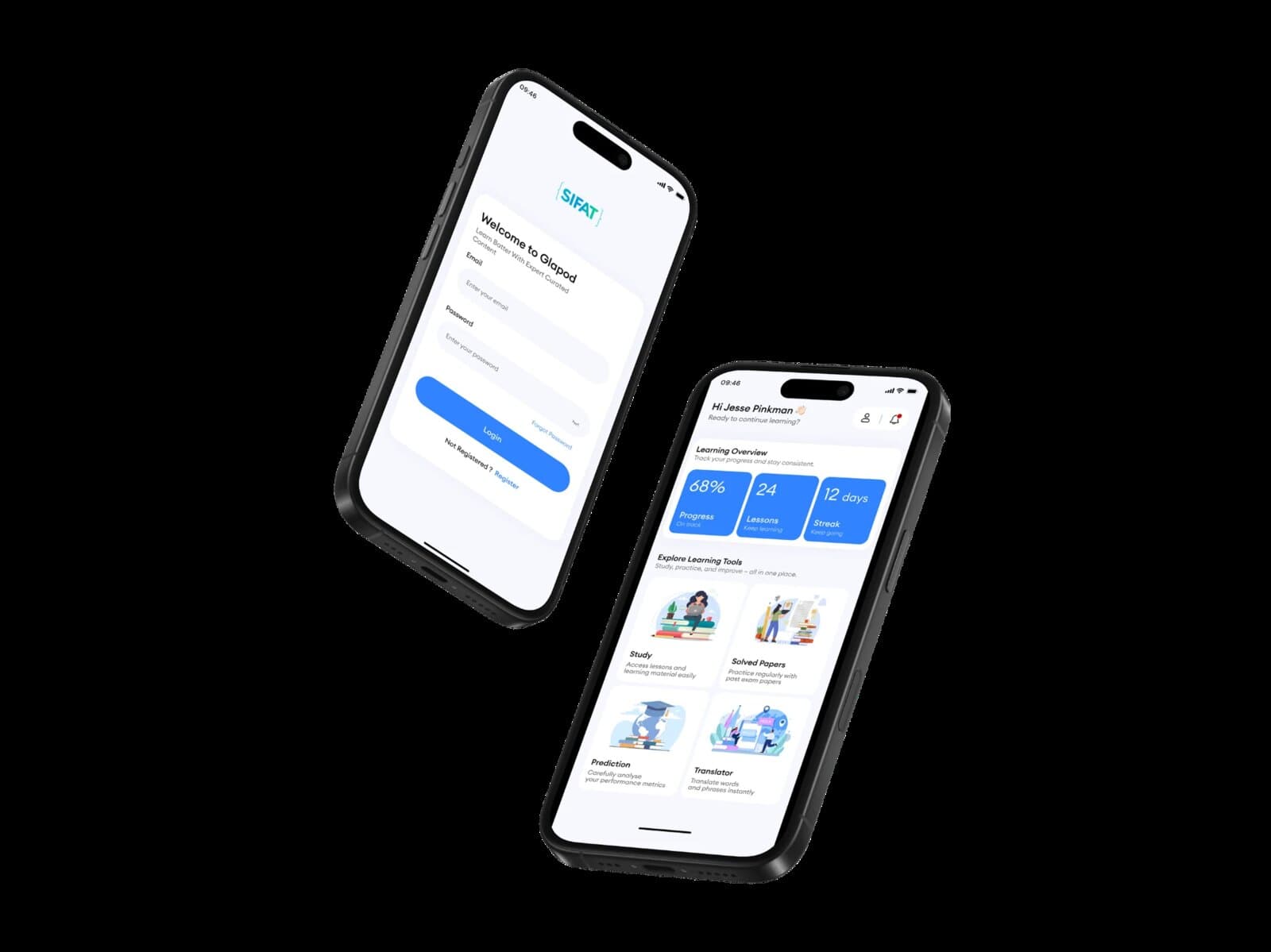
A plain, unhurried sign-in flow — the app reads as a study tool first.
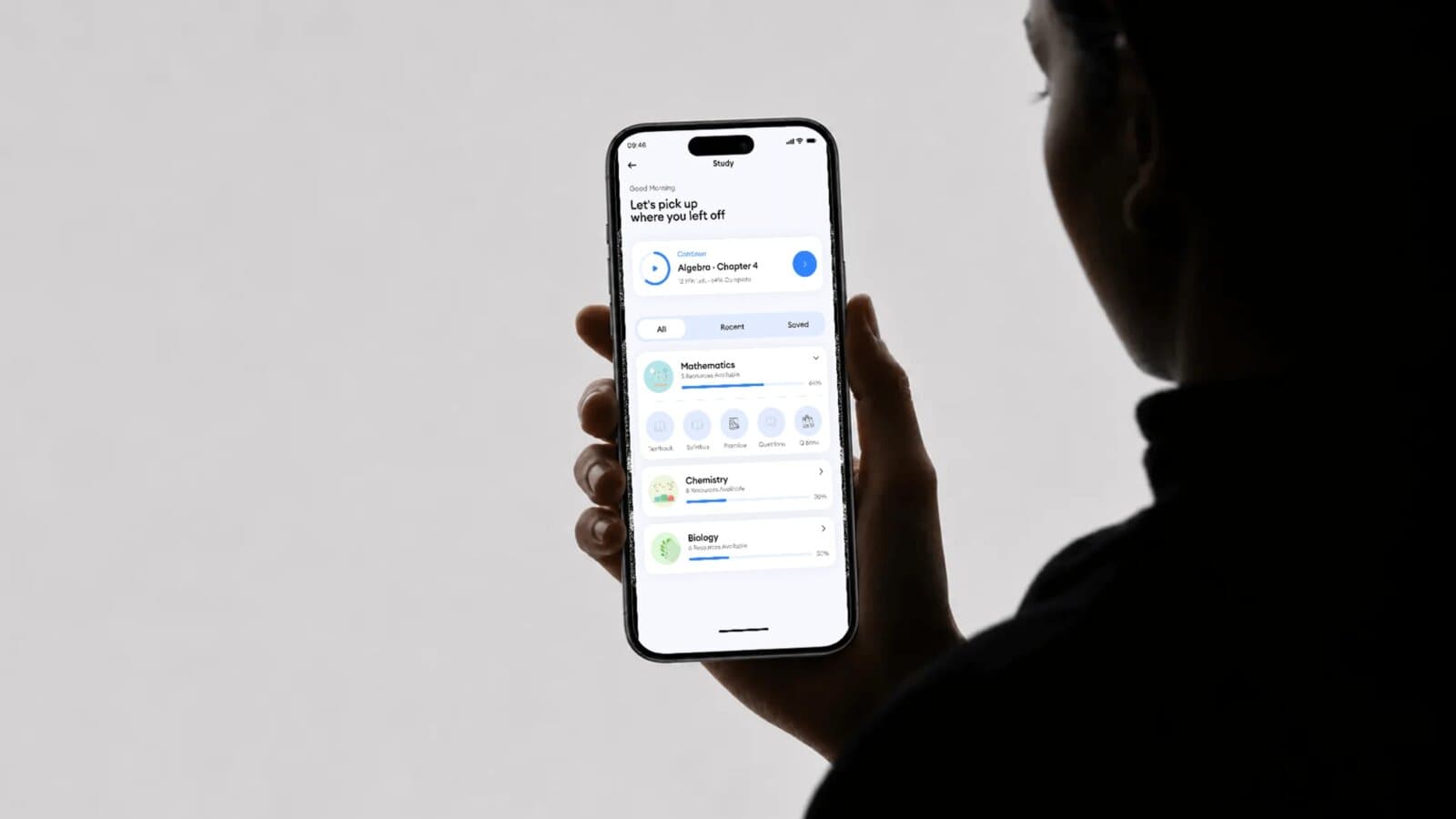
Subjects collapse to one line by default, expanding into resource icons only on tap.

Every Great Brand Begins
with a Great Conversation.
We listen, collaborate, and uncover insights that turn ideas into meaningful brand experiences.
Schedule a call