
AVIS Chauffeur
A chauffeur-booking app built to feel like the cars it reserves — one unhurried screen instead of a five-step form.
Project details
- Category
UI/UX Design
- Discipline
Mobile App Design
About this project
Overview
AVIS came to us wanting a chauffeur-hire app that didn't read like ride-hailing. Someone booking a car by the hour isn't comparing ETAs against three competing drivers — they're expecting the same restraint they'd get from a concierge desk, just delivered from a phone instead of a phone call.
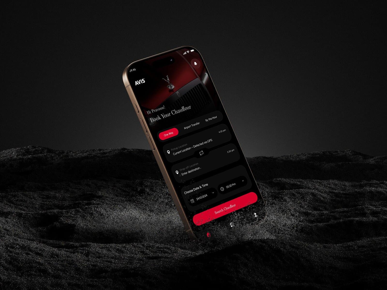
We designed the booking flow around that expectation. One screen holds the entire reservation — trip type, pickup, drop-off, date and time — so a returning client gets from open to booked without a single screen change, and the interface around it carries the weight of the brand rather than a generic booking template.
The Challenge
A dark, editorial interface photographs beautifully and reads poorly the moment real fields have to sit inside it. The brief needed the same near-black surface and the same car photography that makes AVIS's marketing work, but applied to a form people fill in under time pressure — at a gate, from a lobby, usually one-handed. Anything that made the booking fields harder to scan would have undone the reason for the dark treatment in the first place.
Our Approach
We split the screen into two jobs and let each one do only that job. The top third carries the brand — full-bleed car photography, the AVIS mark, a greeting that makes the app feel like it recognizes the person opening it. Everything below is pure function: a segmented control for trip type, a pickup field that resolves itself from GPS by default, one swap icon between pickup and drop-off instead of two fields to re-key by hand, and date and time pickers that sit at the same visual weight as the rest of the form rather than interrupting it as a modal.
Red is reserved for exactly one job — the primary action. Every other control stays within tones of the same near-black surface, so "Search Chauffeur" is the only thing competing for attention once the details are filled in. The vehicle-selection and preference screens that follow — chauffeur language, gender preference, child seat — carry the same restraint: one legible choice at a time, never a page of options presented at once.
What we did
- UI/UX Design
- Mobile App
- Booking Flow
- +more
Inside the project
The brand carries the top third of the screen; the booking form carries the rest.
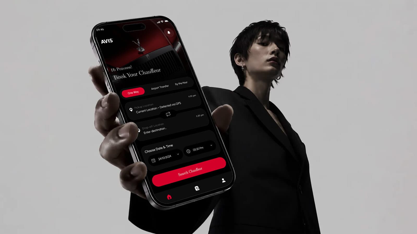
One screen holds the whole reservation — no multi-step flow to lose people partway through.
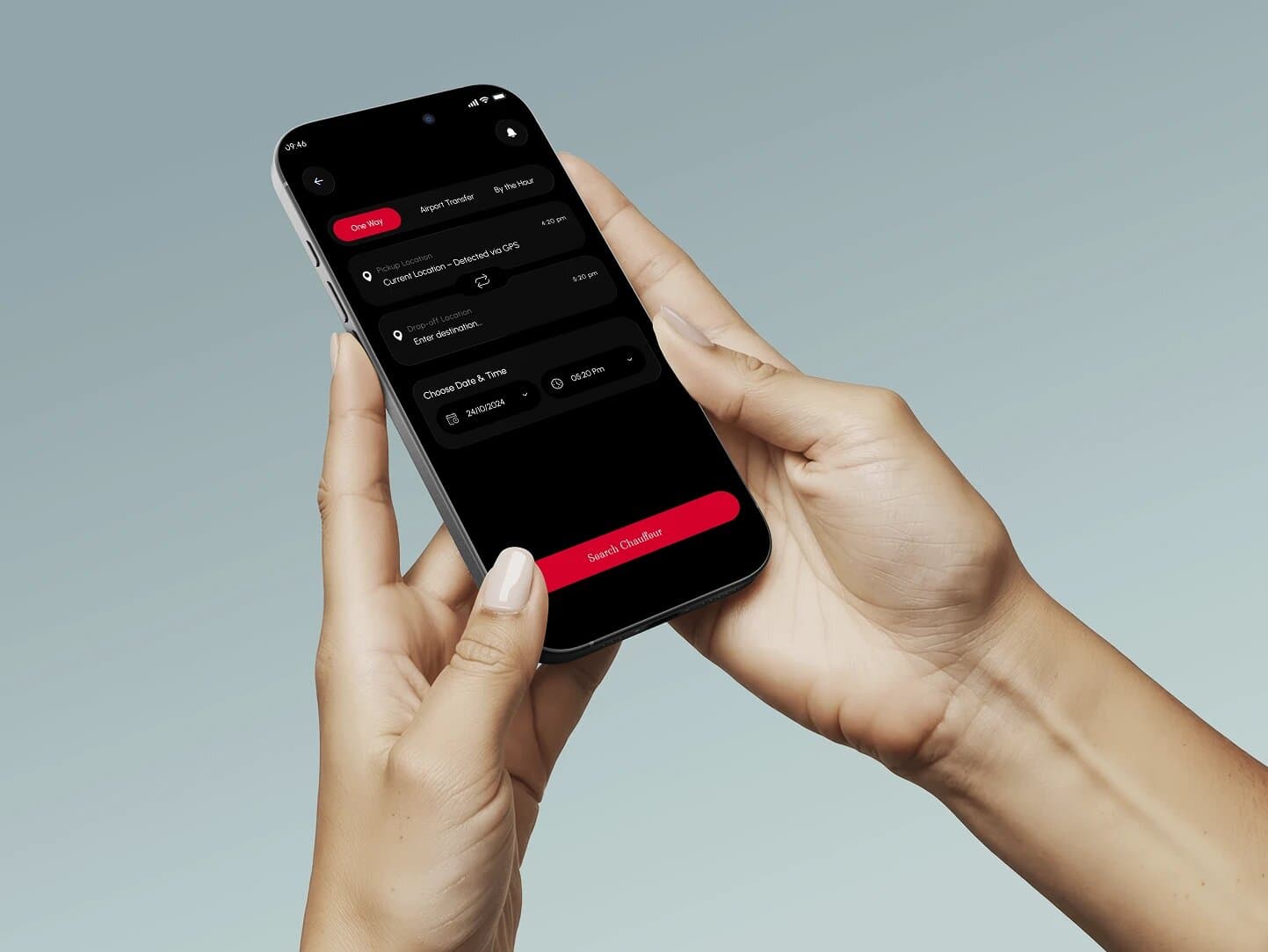
Pickup resolves from GPS by default; a single swap icon replaces re-keying both fields.
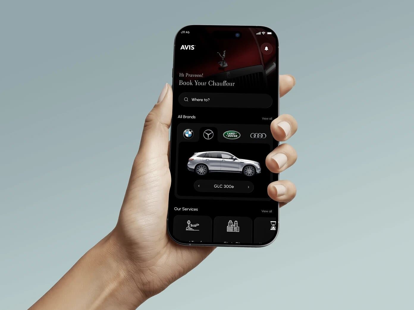
Brand and vehicle browsing sit above the fold, service shortcuts below it.
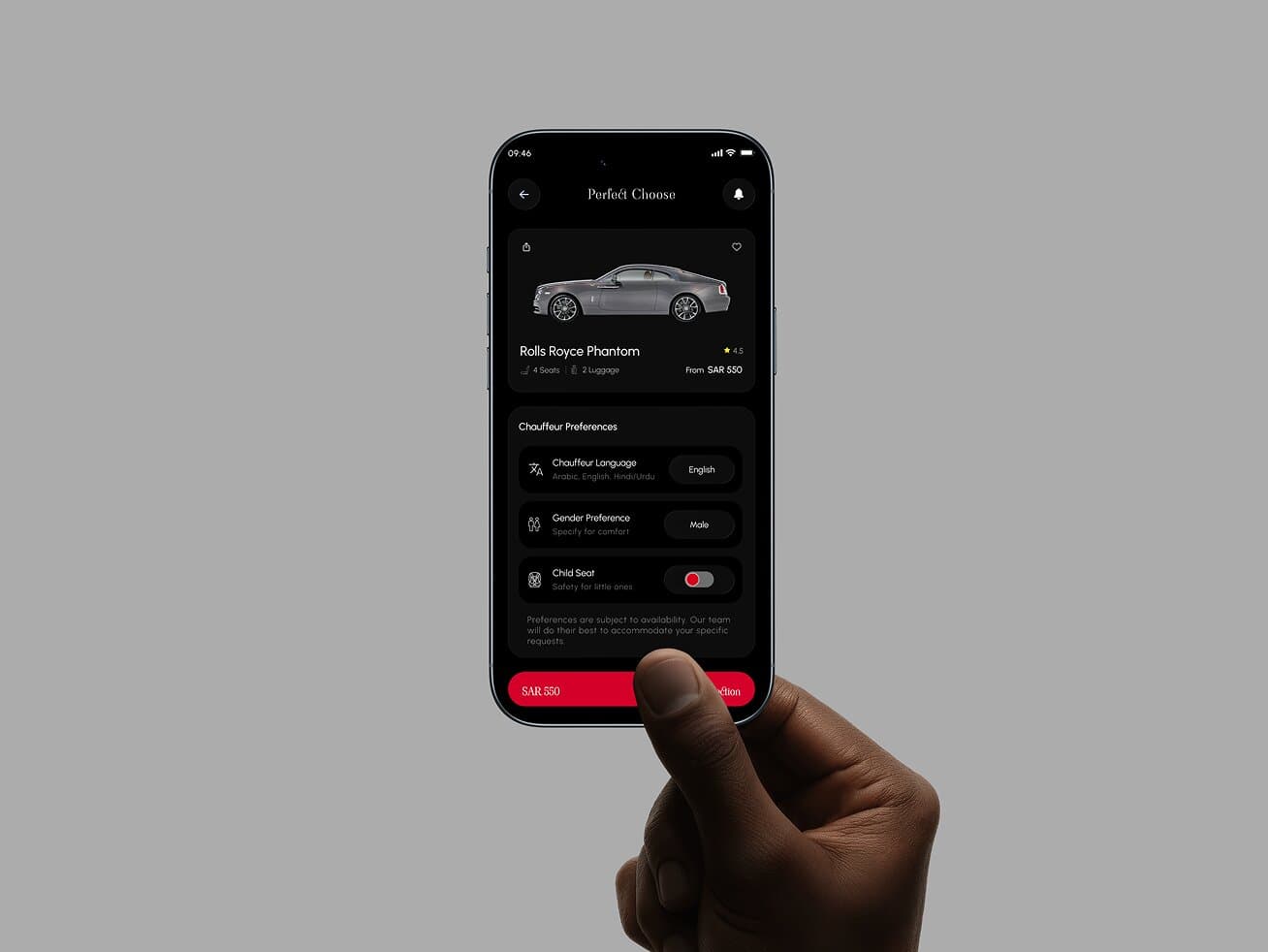
Vehicle detail and chauffeur preferences — language, gender, child seat — kept to one decision at a time.
Every Great Brand Begins
with a Great Conversation.
We listen, collaborate, and uncover insights that turn ideas into meaningful brand experiences.
Schedule a call